%402x.svg)
Rooted in classic arcade design, the UI moves beyond simple text buttons to create interactions that feel more expressive and fun. Familiar visual cues keep things grounded, while layout and structure are kept clear so screens are easy to read and navigate.
The result keeps the personality of the original licenses intact while presenting them in a cleaner, more intentional way that works within the limits of the hardware.
These arcade cabinet interfaces were designed for hardware with strict resolution constraints, most commonly 320×240, matching the native output of the emulated games. At this scale, layout, spacing, and hierarchy required extreme precision, where even a single pixel could impact clarity and balance.
Anti-aliasing, while preferred in high-resolution screens, was intentionally avoided, as it introduced blur and intermediate color values that reduced text legibility at low resolutions. All typography and UI elements were designed pixel perfect, preserving sharp edges and ensuring information remained clear, readable, and visually consistent across screens.

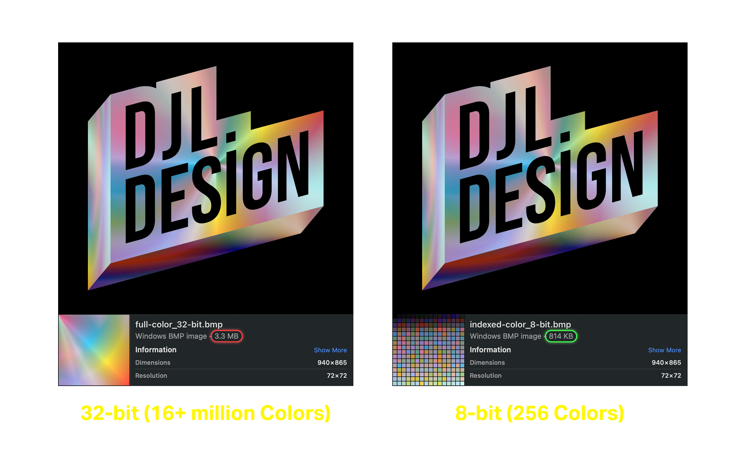
A constrained color palette and optimized assets were used to maintain visual clarity and consistency while supporting the limitations of the hardware.
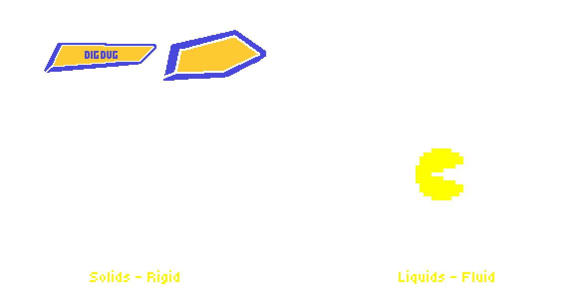
Animation was used to communicate material behavior through timing and motion. Solid elements snap into place with sharp acceleration and firm stops, while liquid elements move with softer easing and follow-through.
By varying timing, spacing, and easing, interactions feel distinct and intentional, helping users intuitively understand responsiveness and state without relying on additional UI elements.